How to edit photos for a black and white film look
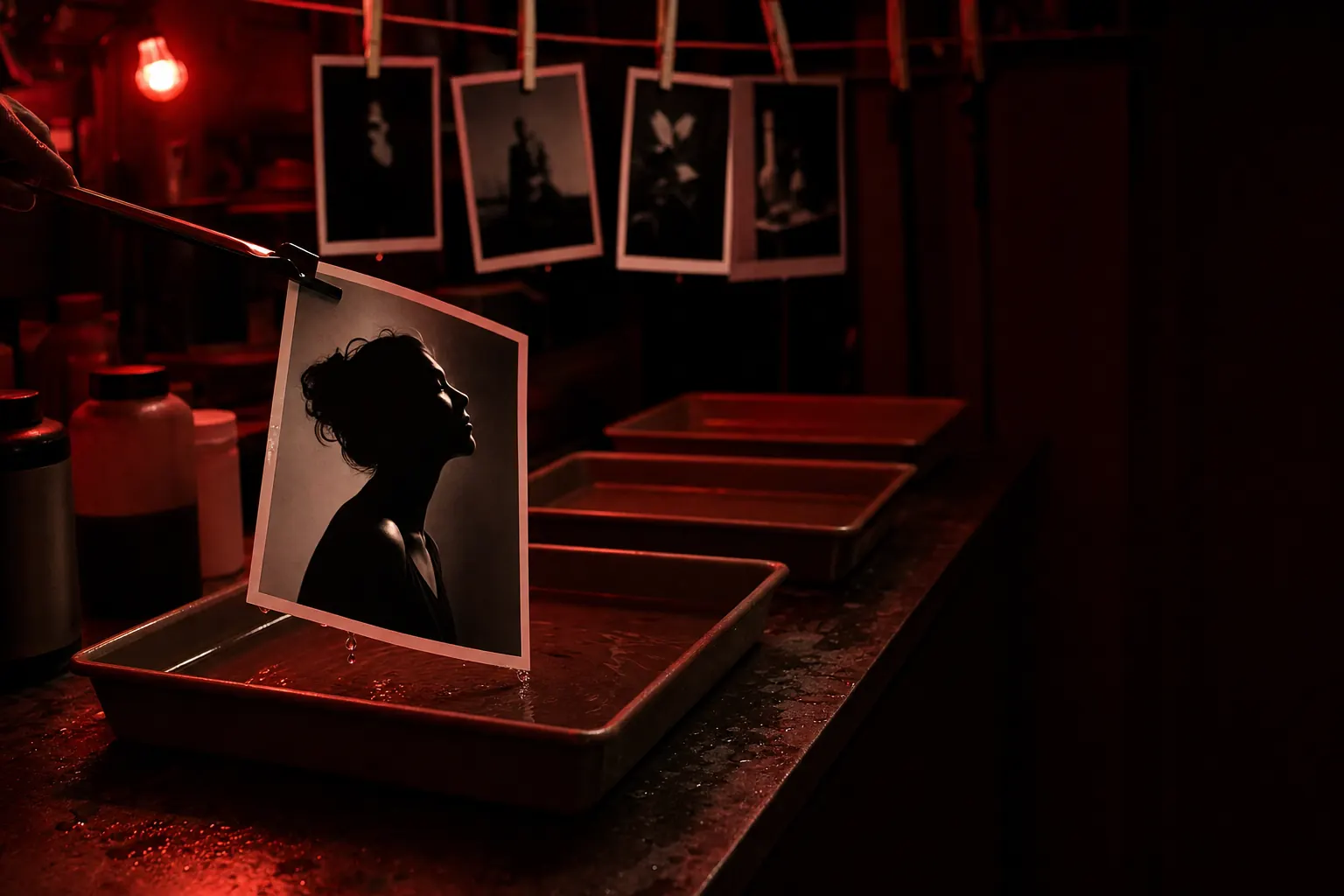
A convincing monochrome film frame needs three things that a desaturate button cannot give you. Gray tones have to be separated according to which colors they came from, so a red jacket and a green hedge of the same brightness do not merge into one flat shape. Something in the frame has to reach true black, and something else has to reach near white. And the grain has to sit in the midtones, where silver actually clumps, rather than in the shadows where digital noise lives. Pull the saturation slider to zero and you get none of the three.
Convert a photo to a black and white film look, step by step
- Choose a photo with directional light. Monochrome lives on light and shape. Side light, window light, hard shadows, strong geometry. A flat, evenly lit color photo that works because of its colors will collapse into gray mush without them.
- Decide which colors become which grays. Before desaturating, use the color mix or channel controls. Darkening blues deepens a sky. Brightening oranges lightens skin. This step is what a colored lens filter did on a film camera, and it is where most of the character is decided.
- Set the black point on purpose. Pull the shadows down until a real part of the frame hits black. Monochrome without a true black looks foggy. One small area is enough. It does not have to be a large region.
- Shape the highlights, then check the skin. Bring the whites up until something near-white appears, then pull the highlight roll-off back so faces keep detail. Faces are where clipping shows first and hurts most.
- Add midtone-weighted grain. Apply grain last and keep it in the middle of the range. In Philmm the black and white profile carries its own grain structure and tone curve together, so the two are already matched.
Desaturation is not conversion
When you remove saturation, the editor collapses each pixel to its brightness value using a fixed formula. A mid-red and a mid-green that had very different visual weight become nearly identical grays, and any shape defined by a color boundary rather than a brightness boundary vanishes. Photographs where color was doing the structural work fall apart completely.
Film photographers solved this with colored filters over the lens. A yellow or red filter darkened blue sky so clouds separated from it; a green filter lightened foliage. The digital equivalent is the per-color mix control, and it is the difference between a photo that happens to lack color and a photo that was made in black and white. Adjust it before anything else, then judge the contrast on the result.
Where the contrast should live
Classic monochrome film has a long, gentle midtone section with abrupt ends. Skin, fabric, and stone get plenty of tonal room in the middle, while the deepest shadows block up to solid black and the brightest highlights compress hard. That shape is why a well-printed frame feels punchy and detailed at the same time, and it is the opposite of the phone default, which protects the ends and flattens the middle.
So the working order is: fix the color mapping, drop the black point until something is genuinely black, raise the white point until something is nearly white, then push midtone contrast until faces and textures have weight. Judge it in a dim room if you can. Screen brightness fools you badly on monochrome, and an image that looks contrasty at full brightness often looks muddy in normal light.

Grain behaves differently without color
In a color image, grain is spread across three dye layers that partly cancel each other, which softens it. In black and white it is a single layer of silver, so the same nominal amount of grain reads considerably stronger. If you carry over a grain setting that looked right in color, expect it to look heavy once the color is gone, and pull it back by roughly a third.
Monochrome also tolerates more grain than color does, artistically speaking. Classic reportage stocks were noticeably gritty and nobody minded, because without color the texture becomes part of the subject rather than an interruption to it. The failure case is not heavy grain, it is grain in the wrong place: shadow-heavy noise that makes a print look underexposed instead of atmospheric.
When a photo should stay in color
Monochrome is a decision, not a rescue. If a photo is dull because the light was flat, removing the color makes it duller. The frames that gain from conversion are the ones where color was a distraction: a great expression ruined by a clashing background, harsh mixed lighting from two different bulbs, a strong shape buried under busy hues.
A fast way to test is to convert and then walk away for a minute. Come back and look at the pair. If you cannot immediately say what the black and white version does better, it is not the right frame for it, and a color film profile will serve the picture more honestly.
Questions
Should I shoot in the camera black and white mode or convert later?
Convert later. Shooting monochrome in camera discards the color data you need for the mapping step, which is where most of the control lives. The in-camera preview is useful for judging a scene, though.
Why do my black and white photos look flat and gray?
Almost always a missing black point. If the darkest pixel in the frame is a dark gray rather than black, the whole image reads as veiled. Pull the shadows down until a small area is genuinely solid.