What makes a good app icon design
A good app icon is legible at 60 pixels, built around a single subject, held to two or three colors, and recognisable from its silhouette alone. Everything else is taste. Those four constraints sound restrictive until you look at the icons you can draw from memory, which all obey them: a camera lens, a musical note on green, a white bird, a blue letter on white.
Legibility at 60 pixels is the actual test
Your icon is displayed at 1024 pixels in exactly one place: the App Store product page. Everywhere else it is small. 180 pixels on the home screen, 120 in Spotlight, 60 in a notification, 48 on a watch. Designers who evaluate at full size ship icons that dissolve in daily use, which is where the relationship with the user actually happens.
So evaluate small from the first draft. Keep the file open at 15 percent zoom in a corner of the screen while you work. Anything you add that does not survive that view is decoration you are paying for in clarity. Thin strokes are the usual casualty: a one-pixel line at 1024 is invisible at 120, so weight the mark heavily enough that it holds.
One subject, not a scene
The instinct to communicate everything the app does produces icons with a phone, a chart, a checkmark and a gradient sky. Pick the single strongest element and drop the rest. A photo editor does not need a camera and a slider and a sparkle. One of those, drawn confidently and large in the frame, will outperform all three.
Metaphor beats literalism when the literal object is boring. A notes app does not have to be a sheet of paper. Bear chose a bear. Things chose a checkbox and nothing else. What the mark needs to do is stay stable in your memory, and unusual objects do that better than generic ones.
Palette discipline and background
Two colors is a good target, three is a ceiling. A solid or subtly graded background with one high-contrast foreground shape is the pattern behind most of the icons you would call well designed. Fill the canvas edge to edge, because iOS masks the corners and any padding you build in makes your icon look smaller than everything next to it in the grid.
Choose the background color against your category rather than against your brand guidelines, if the two conflict. Being the only orange app in a screen of blue ones is worth more than matching a hex code from your website. Check the result on both a light and a dark wallpaper before you decide, since a near-white background that looks crisp on a dark home screen can vanish on a pale one.
Style is a decision, not a default
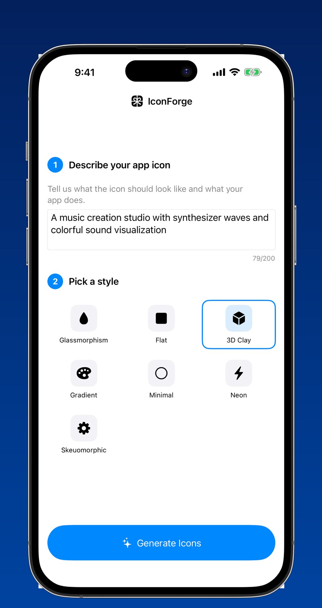
Flat, glassmorphism, 3D clay, gradient, minimal, neon and skeuomorphic are not interchangeable finishes on the same drawing. Each one carries a signal. Flat and minimal read as serious and utilitarian, which suits tools and finance. 3D clay and skeuomorphic read as playful and tactile, which suits games, kids apps and anything creative. Neon reads as nightlife and music. Glassmorphism reads as current, and will date the way every trend does.
Choose the style that matches how you want the app to feel in three years, not the one that looks freshest this month. The safest position is a simple mark rendered in a style with a long shelf life, since a redesign costs you the recognition you spent years accumulating.
Where generation helps, and where it does not
AI generation is good at the part solo developers are worst at: producing enough different directions to actually choose between. Describing a music studio app and getting six compositions back in under a minute replaces the week where a placeholder icon sits in your build because you cannot face opening a vector tool.
It is weaker at the parts that need judgement. It does not know what your competitors look like, it will happily give you a detailed scene that dies at 60 pixels, and it does not know your brand color. So do the thinking yourself: decide the subject, decide the palette direction, decide the style, and let the generation cover the execution. Then apply the black-silhouette test and the 60-pixel test to whatever comes back, and be willing to run it again.
Questions
Should my app icon match my app’s interface?
It should share the palette, not the interface. Using a screenshot or a replica of your UI inside the icon is both unreadable at small sizes and against Apple’s guidelines. Take the accent color from your app and build a distinct mark around it.
Is a single letter or monogram a good app icon?
It works when the letter is genuinely distinctive as a shape and your name is short, which is why one-letter marks succeed for established brands and fail for new ones. A new app with no name recognition usually gets more from an object people can identify at a glance.