iOS app icon size requirements
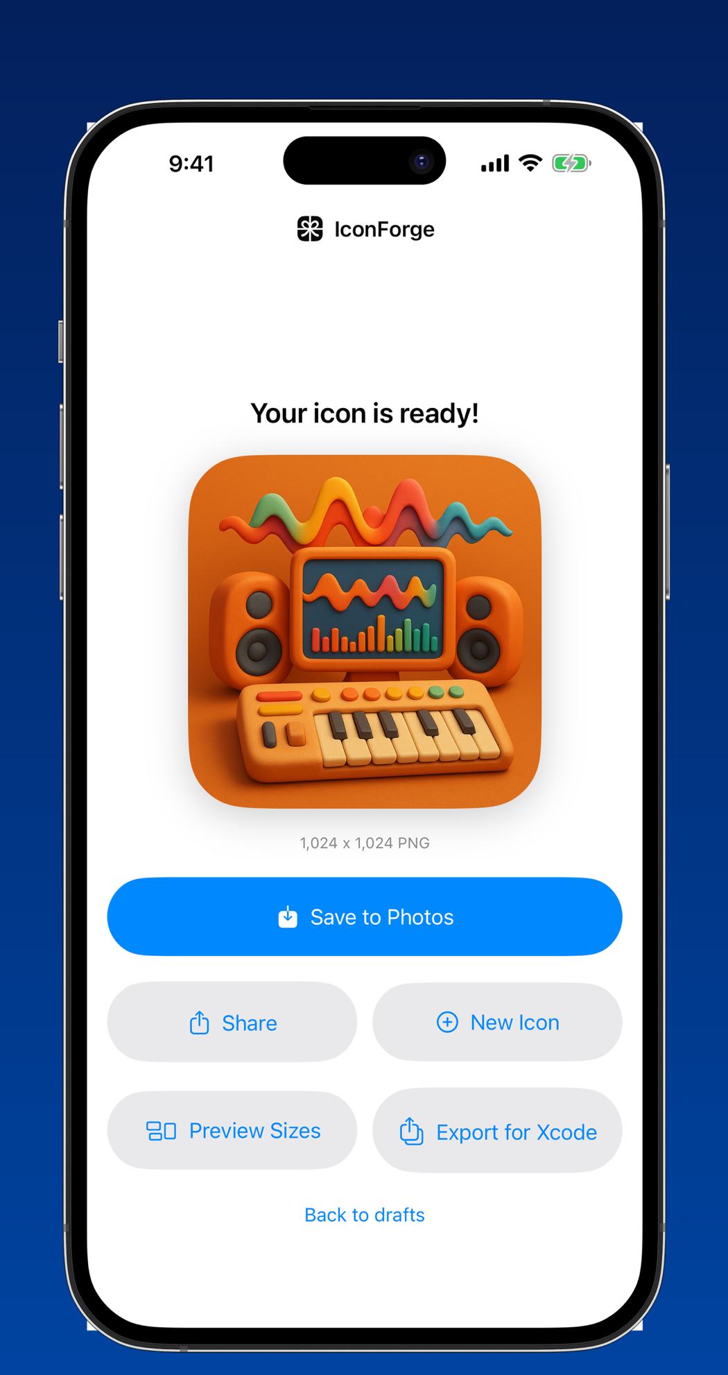
Ship one file: a 1024 by 1024 pixel PNG, square, fully opaque, in sRGB, with the corners left square. iOS draws the rounded shape itself using a superellipse mask, and Xcode derives every smaller size from that single source. If you are still hand-exporting nine PNGs into an asset catalog, you are doing work Xcode stopped requiring several versions ago.
Prepare an App Store ready icon file, step by step
- Work at 1024 by 1024. Design or generate at full size. Anything upscaled from 512 shows soft edges once Apple renders it on a 6.9-inch display at 3x.
- Flatten and strip the alpha channel. Export a flat PNG with no transparency. An alpha channel is the single most common cause of an App Store Connect upload being rejected before review even starts.
- Leave the corners square. Fill the canvas edge to edge. iOS applies the squircle mask at display time, and a pre-rounded icon shows pale corner slivers inside the system shape.
- Drop it into the asset catalog. Modern Xcode projects accept a single 1024 slot for iOS and generate the rest at build time. Only add per-size slots if you genuinely want different artwork at small sizes.
- Check it at 60 pixels. Shrink the file to 60 by 60 and look at it. If the subject turns to mush, the design problem is in the artwork, not the export settings.
The one file that matters: 1024 by 1024
Apple calls this the marketing icon, and it is the image that appears on your product page, in search results, and in the Today tab. The specification is short. PNG format, 1024 by 1024 pixels, square aspect, sRGB or Display P3 color, flattened to a single layer, no alpha channel, no transparency of any kind, and no rounded corners cut into the artwork.
That last rule trips up designers coming from web work. On the web you round your own corners. On iOS the system owns the shape, and it is not a plain rounded rectangle. Apple uses a continuous curve where the radius eases into the straight edge, which is why an icon rounded in Figma with a standard corner radius never quite lines up with its neighbours on the home screen.
Color profile matters less than people fear. Tag the file sRGB and it will render correctly everywhere. Display P3 buys you a wider gamut on modern screens, and Apple accepts it, but the difference is invisible on the majority of icon-sized artwork.
Every size iOS derives from it
Xcode generates these from the 1024 master, but it is worth knowing what they are, because these are the sizes your design is actually judged at. iPhone home screen is 180 by 180 at 3x and 120 by 120 at 2x. Spotlight is 120 and 80. Settings is 87 and 58. Notifications are 60 and 40. iPad home screen is 152, and iPad Pro is 167. Apple Watch runs from a 48-pixel notification glyph up to 1024 for the App Store listing.
macOS is the exception that catches people out. Mac icons are drawn inside their own rounded rectangle with visible margin around it, supplied from 16 by 16 all the way to 1024, and they are expected to include that padding and shape in the artwork. A full-bleed iOS icon dropped straight into a Mac target looks oversized and square-shouldered in the Dock.
One more moving part worth knowing about: recent Xcode releases ship Icon Composer, which takes layered artwork and produces light, dark and tinted variants of the same icon. That is an addition rather than a replacement. A flat 1024 PNG is still the format every pipeline, store listing, press kit and third-party asset generator accepts.
What gets an icon bounced
Three problems account for most icon rejections and near-misses. Transparency is the first, and App Store Connect catches it during upload rather than in review, so you find out at the worst possible moment. Second is artwork that includes the Apple logo, a rendered iPhone, or replicated system UI, all of which Apple explicitly disallows. Third is an icon that promises something the app does not deliver, which reviewers do flag under the misleading-metadata rules.
Text inside the icon is not against the rules, but it fails on its own merits. At 60 pixels a word is a grey smear, and localised builds leave you shipping an English word to users who cannot read it. If the icon needs a label, remember that iOS already draws your app name underneath it.
Questions
Can an iOS app icon have a transparent background?
No. The 1024 marketing icon must be fully opaque with no alpha channel. If your artwork has a transparent background, composite it onto a solid color or gradient before exporting, because App Store Connect rejects the upload otherwise.
Do I still need to export every icon size by hand?
Not for iOS. Current Xcode versions accept a single 1024 by 1024 image and generate the smaller sizes at build time. Hand-exporting is still useful when you want simplified artwork at tiny sizes, or when a Mac target needs its own padded version.