Custom app icons for an aesthetic iPhone home screen
There are two routes, and they solve different problems. The built-in one lives in the home screen editor: touch and hold the wallpaper, tap Edit, then Customize, and you can tint every icon to one color or switch the whole screen to dark or clear. The custom-artwork route runs through the Shortcuts app, where an Open App shortcut added to the home screen carries any image you choose. Route one is instant and reversible. Route two gives you total control and costs you notification badges.
Replace an iPhone app icon with your own image, step by step
- Get your icon images into Photos. Square images work best, ideally 1024 by 1024 so they stay sharp on a Pro Max display. Save the whole set to a single album so you are not hunting through your camera roll later.
- Create an Open App shortcut. Open Shortcuts, tap the plus button, add the Open App action, and pick the app you want to launch.
- Name it what you want under the icon. Whatever you call the shortcut is the label iOS prints on the home screen, so use the real app name unless you want something shorter.
- Add to Home Screen and swap the image. Open the share menu, choose Add to Home Screen, tap the small icon preview next to the name, then Choose Photo and pick your artwork.
- Hide the originals. Long-press each original app, choose Remove App, then Remove from Home Screen. The app stays installed in the App Library and your custom tile launches it.
The built-in route: tinted, dark and large icons
Recent iOS versions moved a lot of home screen customisation into the system. In the Customize sheet you get Small and Large icon sizes, where Large drops the app names entirely, plus Automatic, Dark, Clear and Tinted. Tinted recolors every icon on the device to a single hue you pick with a slider or sample from your wallpaper with an eyedropper.
This is the sensible starting point for anyone who wants a coordinated home screen rather than a specific illustration set. It applies to every app including ones you install later, it survives updates, and turning it off takes two taps. The limitation is obvious: you are choosing one filter for everything, so you cannot give the weather app a sun and the notes app a pencil.
The Shortcuts route, and what it costs
A shortcut tile can carry any image, which is why every aesthetic home screen you have seen on Pinterest was built this way. It is worth knowing the trade before you spend an evening on it. Shortcut tiles do not display notification badges, so the red unread count on your messages app disappears. Launching goes through Shortcuts, which adds a brief handoff. Long-pressing a shortcut tile gives you the Shortcuts menu rather than the app quick actions. And the tiles are not tied to the app, so an uninstall leaves a dead square behind.
None of that stops people, because the visual payoff is real. The practical compromise most people land on is a custom first page of the apps they open by muscle memory, with everything notification-driven left on page two with its real icon and badge intact.
Making twenty icons look like a set
The hard part is coherence. Pull twenty images from twenty sources and you get twenty different line weights, background shades and levels of detail, which reads as clutter no matter how nice each individual image is. A set works when the palette, the illustration style and the amount of padding around the subject stay constant across every tile.
Generating them yourself is the reliable way to hold that constant. In IconForge you pick one style, Minimal or 3D Clay or Glassmorphism, and describe each app in turn: a folded paper map for maps, a stack of coins for banking, a small sprouting plant for the habit tracker. Same style, same treatment, different subject. Each one comes out at 1024 by 1024 and saves straight to Photos, which is exactly where the Shortcuts picker expects to find it.
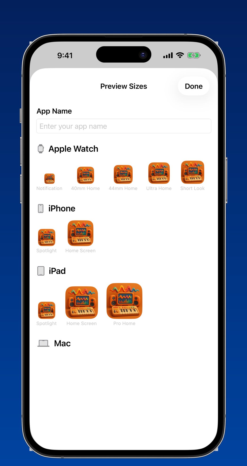
One habit worth adopting before you commit: check the artwork at real size. The preview sheet renders your icon everywhere iOS will draw it, from a 24-point Apple Watch notification up to the Mac Dock, so you can see whether that delicate line drawing survives at home screen size before you build twenty of them.
Wallpaper and grid decisions that do the rest
Icons only account for half the look. A low-contrast wallpaper lets them read as a grid instead of fighting the background, and a heavily blurred photograph works better than anything detailed. If you went with Large icons and lost the app names, keep the artwork obvious: a minimal abstract shape is beautiful and useless when you are trying to find your bank at a checkout.
Questions
Do custom home screen icons show notification badges?
Shortcut tiles do not. The badge stays on the original app icon, which you have usually hidden in the App Library. Icons customised through the built-in Tinted or Dark options keep their badges, because they are still the real app icons.
Do custom icons disappear after an iOS update?
The tiles survive updates because they are shortcuts stored on your device. What breaks them is deleting the underlying app or losing the source images, so keep your artwork in a dedicated Photos album and you can rebuild any tile in under a minute.