How to make an app icon that stands out on the App Store
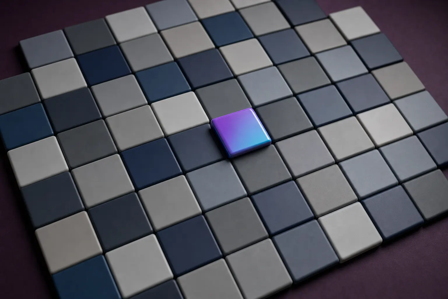
Search your own keywords on the App Store and screenshot the results. Whatever color and shape dominate that grid is the thing your icon has to avoid. Standing out is measured against neighbours, so the design decision that matters most is made before you open any tool: pick the visual territory your category has left empty, then execute one simple idea inside it.
Design an icon that stands out in search results, step by step
- Screenshot your own search results. Search the two or three terms you expect to rank for and capture the results grid. This is the wall your icon has to survive, and it is more useful than any inspiration board.
- Name the dominant color and shape. Count them. Productivity is mostly blue. Finance is blue and green. Meditation is gradients. Whatever is over-represented becomes your no-go zone.
- Pick one subject. One object, one letterform, or one abstract mark. Two competing subjects at 120 pixels read as noise.
- Generate variants before committing. Describe the app and the mark, choose a style, and compare a full set of concepts side by side rather than iterating on the first idea you had.
- Judge them small. Shrink every candidate to home screen size and put it among real competitor icons. The winner at 1024 is often not the winner at 120.
Audit the shelf before you design anything
App Store search results are a grid of small squares, and your icon is competing for a glance that lasts well under a second. Category conventions build up fast: banking apps drift toward navy and green, habit trackers toward soft gradients, camera apps toward black with an aperture shape. Following the convention makes you look legitimate and invisible at the same time.
The apps people remember broke from their category color rather than their category metaphor. Snapchat is yellow in a field of blue messengers. Netflix is red among grey video services. Duolingo is a green cartoon bird surrounded by serious-looking language apps. In each case the metaphor is conventional and the color is not, which is the trade worth copying.
One idea, executed with contrast
A strong icon has a silhouette you could recognise as a solid black shape. That is a useful working test: flatten your candidate to pure black on white and see whether anything is left. If the design only works because of fine detail, gradients and internal texture, it will not survive the thumbnail.
Contrast between the mark and the background does most of the heavy lifting. Two or three colors is usually the ceiling. A confident background fill with a single high-contrast subject reads at every size, while a busy scene collapses into a colored blur the moment iOS renders it at 40 pixels for a notification.
Generate widely, then narrow
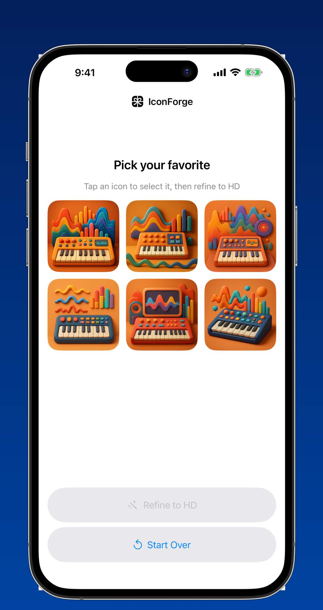
The practical problem for a solo developer is that comparing directions requires having several, and producing several by hand is slow. Describing the app in a sentence and getting six distinct concepts back changes the economics of that comparison. IconForge does exactly this: you write what the app does and what the icon should look like, choose a style, and get six concepts rather than six small edits of one concept.
Use the batch the way an art director would use a pitch. Discard four immediately. Keep the two that read differently from each other, refine one to full resolution, and only then start arguing about the shade of orange.
Test at the size people will actually see
Print your shortlist at 120 pixels, or drop the files into a mock results grid next to five real competitors. Ask someone who has never seen the app which square their eye lands on first. That answer is worth more than your own opinion, because you have been staring at the artwork at 1024 for an hour and your brain is filling in detail nobody else can see.
Once it ships, treat the icon as testable. App Store Connect supports alternate icons for product page optimisation, and a color change alone has moved tap-through rates by double-digit percentages for plenty of small apps. Change one variable at a time and give each test enough impressions to mean something.
Questions
Should the app icon include the app name?
Almost never. Text is unreadable at notification and Spotlight sizes, and iOS already prints your app name directly beneath the icon. The exception is a wordmark that is genuinely your brand, such as a single stylised letter, which works because it is a shape rather than a word.
How often should I change my app icon?
Rarely, and never casually. Users find your app by shape and color, so a redesign costs recognition. Test a new icon against the old one on your product page before replacing it, and keep the dominant color if you can.