How to choose a paint color for your living room
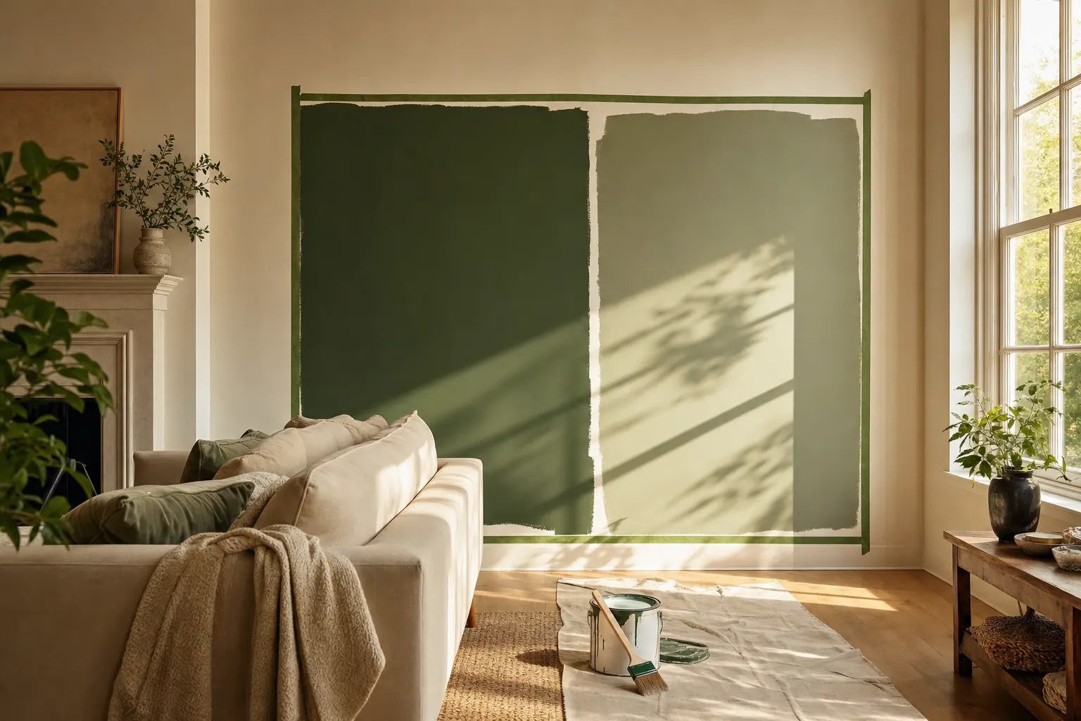
Start with what you cannot change: the sofa, the floor, the direction your windows face. Pick two or three candidate colors that work with those fixed elements, and test them on a photo of your own room before you buy anything. The expensive mistake is choosing from a 2-inch swatch card under store lighting; a color that looks quiet on the card can go swampy on a full wall at dusk.
Choose a living room paint color, step by step
- List the fixed elements. Write down the colors already committed in the room: flooring, sofa, large rugs, curtains, fireplace. New paint has to work with these, not against them.
- Read the light. North-facing rooms cool every color down; south-facing rooms warm them up. Check the room at morning, midday, and evening before shortlisting.
- Shortlist three candidates. One safe neutral, one mid-tone, one color you are slightly scared of. The scary one wins more often than people expect.
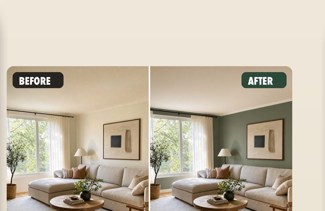
- Test on a photo of your room. Photograph the room in its normal light and preview each candidate on the actual walls. Repaint renders the photo with the color applied to the surfaces you choose, keeping your lighting and furniture.
- Confirm with one real sample. Buy a single sample pot of the winner and paint a large patch near the trim. If it matches what the preview showed, order the paint.
Why swatch cards mislead
A paint chip is a few square centimeters viewed at arm’s length under retail lighting. A wall is several square meters lit by your windows, your lamps, and reflections from your own floor. Colors scale up darker and more saturated than the card suggests, and undertones that were invisible on the chip become the main event on a wall. This is why the classic advice is to paint big test patches, and why people who skip that step end up repainting.
Sample pots fix the scale problem but introduce two new ones: cost and time. Pots run about $10 each, each needs a patch, dry time, and a day of checking in different light. Testing five candidates is a weekend and $50 before the first real can is bought.
Test colors on your actual room, not a showroom
The useful middle step is previewing candidates on a photograph of your own living room. Repaint takes one photo and re-renders it with your chosen color applied: same daylight, same furniture, same shadows, with edges that stop where walls stop. Comparing a forest green against a warm white on your real sofa and your real floor answers in a minute what sample pots answer in a weekend.
Rules of thumb that survive contact with real rooms
Go one shade lighter than the color you fell for, because walls amplify. If the room faces north, add warmth; cool grays turn institutional fast. Match undertones with the floor: yellow-oak floors fight pink-beige walls but sit well with greens and warm whites. Keep the ceiling white unless you are decorating with intent; a tinted ceiling lowers a room visually.
And decide with the largest preview you can get. Whether that is a photorealistic mock-up or a meter-wide painted patch, the confidence comes from scale.
Questions
Should the living room be lighter or darker than the hallway?
Slightly lighter usually reads best, because living rooms have more window light to work with. A darker living room can work when the hallway is bright and the living room has good lamps for the evening.
How many test colors is too many?
Three serious candidates. More than that and the comparisons blur; fewer and you have not really explored. Preview widely in the app, then sample the finalist.